- Home

- Report


"TableValue" Text widget parameter
Text Widget Parameters allows you to add dynamic values to your charts by using Yellowfin’s text widgets. These include the name and description of the report, filters, parameter values and even column totals.
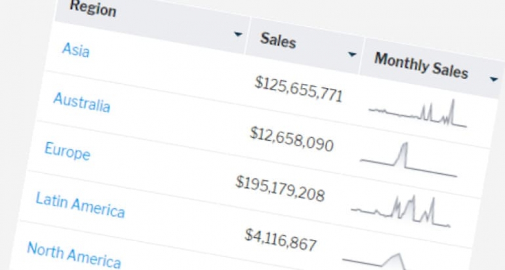
Sparklines
Most of the time, all you need in a table is data as text and numbers. But sometimes, you’d like to visualize results in each row, too. That’s especially true when each row of data is a trend over time.

Improve the readability of reports
One of the main design concepts of reports is to make sure that your audience understand and can interpret the data. If they don’t understand the message you are trying to convey, you have failed, and the report is of no value to the business.

Turning Text into Hyperlinks
This article explains how to use the Link to URL column formatting option to create hypertext links within a field.
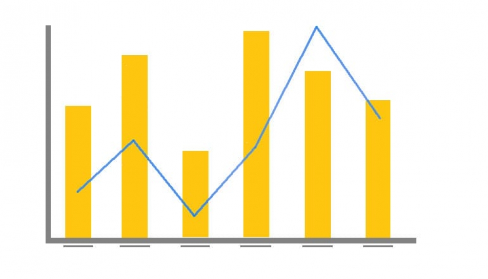
Combination Overlay Charts
Sometimes it’s necessary to plot two or more sets of values on a single chart. However, if the scales of the measures are different the smaller measure might get lost.

Solved: Charts displaying too many categories
Ever wanted to display your data in a chart but found that there were just too many categories? The good news is that Yellowfin introduced new functionality that can solve this headache.

Drill functionality by Chart Type
Last week I was trying to get the Drill Through relationships to work in a line chart. The horizontal axis for the line chart was set to a date field and the vertical axis to a metric. How hard can this be??

Freehand SQL reports
Most users will use the Drag and Drop report creation method to build their reports. This is the default builder, taking the complexity of the database out of the equation.
Popular Posts
- Freehand SQL reports Written on Sunday, 18 November 2018 21:18

- Speed up your website data analysis Written on Monday, 09 July 2018 19:27