- Home

- Charts

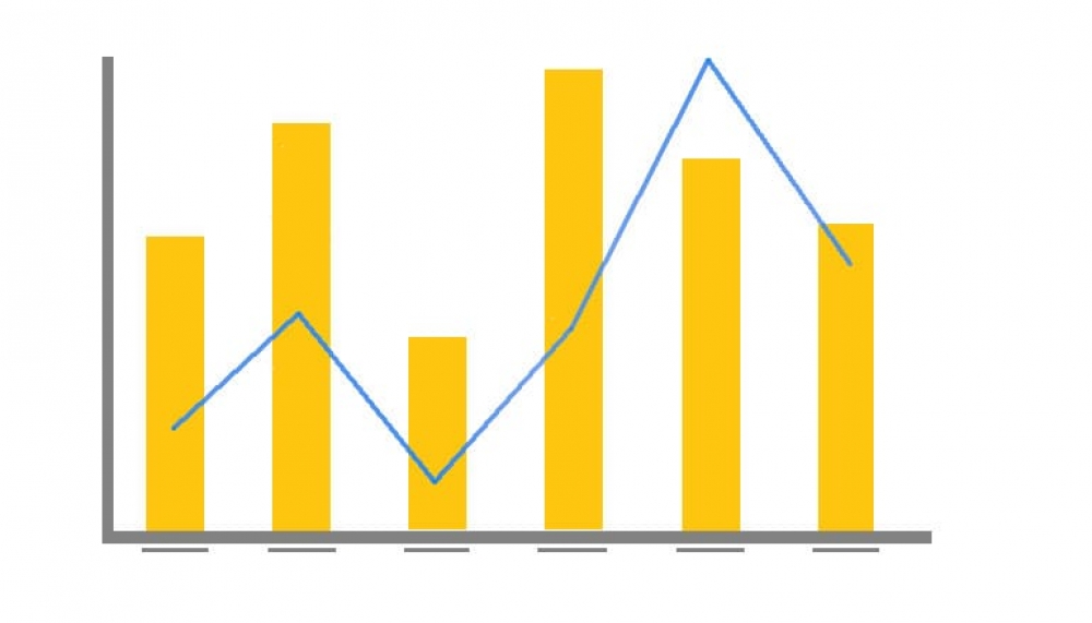
Combination Overlay Charts
Sometimes it’s necessary to plot two or more sets of values on a single chart. However, if the scales of the measures are different the smaller measure might get lost.
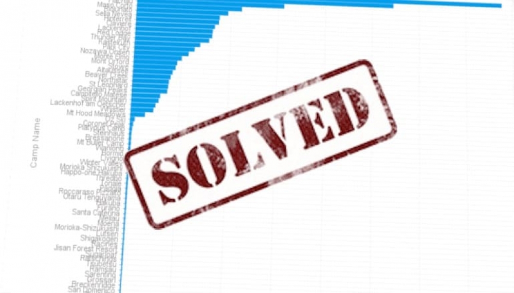
Solved: Charts displaying too many categories
Ever wanted to display your data in a chart but found that there were just too many categories? The good news is that Yellowfin introduced new functionality that can solve this headache.
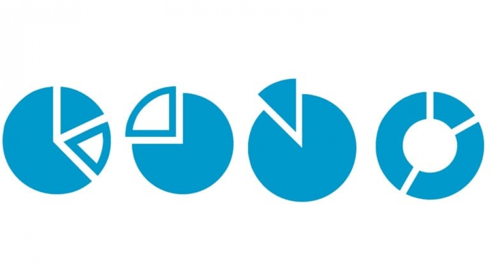
The Pie Chart: Friend or Foe?
We use charts to show information in a visual manner that enhances the interpretation and analysis of data. Using charts or graphs takes away the complexity of the data and emphasize the message that we are trying to convey.
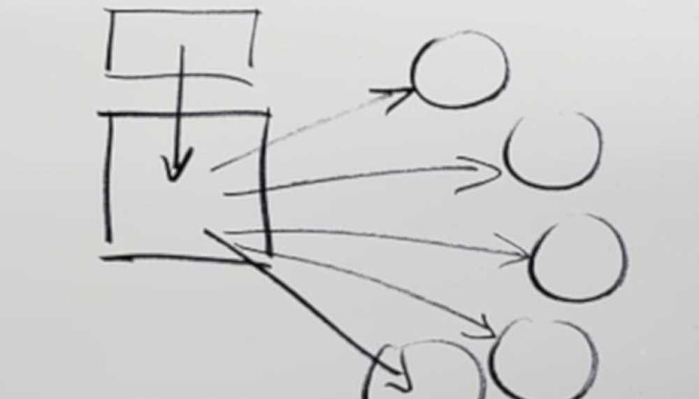
Drill functionality by Chart Type
Last week I was trying to get the Drill Through relationships to work in a line chart. The horizontal axis for the line chart was set to a date field and the vertical axis to a metric. How hard can this be??
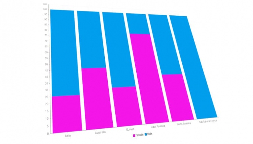
100% Stacked Column Charts
The 100% Stacked Column Chart is an extension of the Stacked Column chart in that it compares the percentage that each value contributes to a total.
Choosing the right chart type
Using charts or graphs are a great way to present data and often the preferred manner that our users view their data.

Adding context to your charts
A few articles back, I wrote about Parameter Replacement in Yellowfin to provide better narratives to your reports and dashboards. Another feature that goes hand in hand with this is Set Analysis.
Time Series Charts
When using a date field in a chart, you have the option to enable the Time Series functionality. This will allow you to convert your time axis to display as a proper time scale and view your data trends and patterns over time, rather than what I call a categorical type display.
Popular Posts
- Freehand SQL reports Written on Sunday, 18 November 2018 21:18
- Speed up your website data analysis Written on Monday, 09 July 2018 19:27