Loading...

Content Creation

Read More
Tooltips on your Dashboards

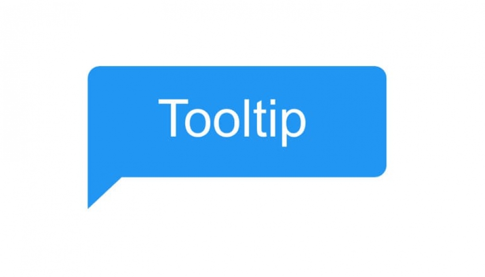
A tooltip is a small, interactive, and textual hint that is often used to specify additional information about a something when the user moves the mouse pointer over an element. Tooltips are usually highly contextual and can be attached to any active element on a dashboard, this includes icons, images, and buttons.

Read More
"TableValue" Text widget parameter

Text Widget Parameters allows you to add dynamic values to your charts by using Yellowfin’s text widgets. These include the name and description of the report, filters, parameter values and even column totals.

Read More
Sparklines

Most of the time, all you need in a table is data as text and numbers. But sometimes, you’d like to visualize results in each row, too. That’s especially true when each row of data is a trend over time.

Read More
Improve the readability of reports

One of the main design concepts of reports is to make sure that your audience understand and can interpret the data. If they don’t understand the message you are trying to convey, you have failed, and the report is of no value to the business.

Read More
Turning Text into Hyperlinks

This article explains how to use the Link to URL column formatting option to create hypertext links within a field.

Read More
Combination Overlay Charts

Sometimes it’s necessary to plot two or more sets of values on a single chart. However, if the scales of the measures are different the smaller measure might get lost.

Read More
Solved: Charts displaying too many categories

Ever wanted to display your data in a chart but found that there were just too many categories? The good news is that Yellowfin introduced new functionality that can solve this headache.

Read More
The Pie Chart: Friend or Foe?

We use charts to show information in a visual manner that enhances the interpretation and analysis of data. Using charts or graphs takes away the complexity of the data and emphasize the message that we are trying to convey.